I remember sitting on the floor of a tiny, sun-drenched studio in Florence, clutching my sketchbook and feeling completely suffocated by the sheer density of my own belongings. I had all these grand ideas for a living space, but I was staring at four cramped walls that felt like they were slowly closing in on me. Most design gurus will tell you that you need to gut the place or spend a fortune on minimalist furniture to fix the problem, but that’s just nonsense. Learning how to make a small room look bigger isn’t about stripping your life away; it’s about understanding the rhythm of light and the way our eyes travel across a space.
I’m not here to sell you on expensive, hollow trends or complicated architectural hacks that require a construction crew. Instead, I want to share the practical, soul-nourishing strategies I’ve gathered from years of designing both sprawling gardens and tight urban corners. We are going to dive into how you can use color, texture, and strategic placement to trick the eye and breathe life into your home. My promise is simple: I’ll show you how to transform your limited square footage into a living canvas that feels as expansive as a California meadow.
Table of Contents
- Light Color Palettes for Small Interiors Painting With Sunlight
- Using Mirrors to Expand Space Creating Windows to New Worlds
- Sculpting the Void: Five Ways to Let Your Space Breathe
- The Architect’s Blueprint: Final Thoughts for Your Living Canvas
- The Illusion of Boundless Horizons
- Cultivating Your Personal Sanctuary
- Frequently Asked Questions
Light Color Palettes for Small Interiors Painting With Sunlight
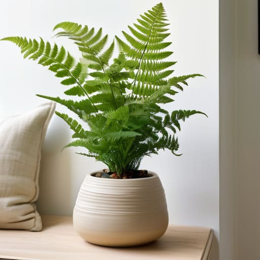
When I’m sketching out a new garden layout, I often think about how light dances through the leaves of a weeping willow—it’s all about the interplay of shadow and brightness. In a tiny room, you can apply that same logic by treating your walls like a canvas. Choosing light color palettes for small interiors isn’t just about picking white; it’s about selecting soft, airy hues like pale sage or a sun-bleached sand that reflect the natural glow. I like to tell my little potted fern, Barnaby, that he looks much happier when the room feels bright and open, and honestly, I think he’s right.
To truly amplify this effect, you have to look beyond just the paint. I’ve found that using mirrors to expand space is one of the most effective ways to trick the eye into seeing a horizon where there was once only a wall. By placing a mirror strategically across from a window, you’re essentially inviting the sun to come inside and play. This technique, combined with minimizing visual clutter, allows the light to flow uninterrupted, transforming a cramped corner into a luminous sanctuary that feels like it’s breathing.
Using Mirrors to Expand Space Creating Windows to New Worlds
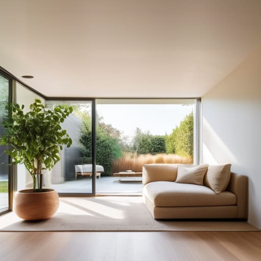
If I were sketching a courtyard in a dense corner of Rome, I wouldn’t just look at the walls; I’d look for ways to trick the eye into seeing the horizon. In a compact room, mirrors are your most magical tool—they act as portals, effectively using mirrors to expand space by mimicking the depth of a window. I like to think of a large, floor-to-ceiling mirror as a “silent garden,” reflecting the movement of light and the textures of your decor to create an illusion of endlessness. By placing a mirror directly opposite your primary light source, you aren’t just adding a surface; you are capturing sunlight and throwing it back into the room, instantly dissolving the heavy feeling of enclosed walls.
However, the secret lies in the placement. Instead of just hanging a small piece haphazardly, try grouping mirrors to create a rhythmic flow that guides the eye through the room. This is one of those essential interior design tricks for tiny rooms that prevents a space from feeling stagnant. When you strategically position a mirror near a reading nook or a cluster of greenery—I’d introduce a leafy Fern named Barnaby here—it doubles the visual presence of your plants, making the entire environment feel lush, airy, and profoundly more alive.
Sculpting the Void: Five Ways to Let Your Space Breathe
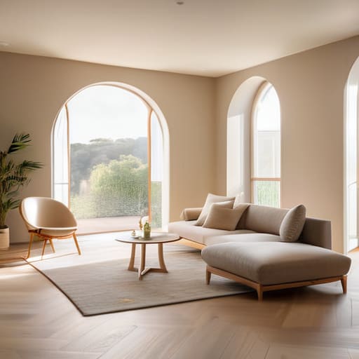
- Verticality is your secret ally; instead of crowding the floor with heavy furniture, I like to draw the eye upward toward the ceiling. Think of it like a climbing vine—by installing floor-to-ceiling shelving or hanging art slightly higher than eye level, you trick the brain into perceiving a much grander, loftier volume than actually exists.
- Embrace the “Leggy” Look: When selecting furniture, steer clear of bulky, skirted pieces that sit heavy on the ground like stubborn boulders. Choose chairs and sofas with slender, exposed legs; seeing the floor continue underneath the furniture creates a sense of continuous flow and prevents the room from feeling “choked” by its own contents.
- Zone with Texture, Not Walls: In a tiny apartment, physical dividers are the enemy of openness. Instead, I use rugs and varying textures to define “rooms” within a room. It’s much like how I might use a cluster of ferns—let’s call them Barnaby and Beatrice—to create a soft boundary in a garden without ever blocking the view or the breeze.
- The Magic of Transparency: Incorporate materials that play with light rather than blocking it. A glass coffee table or a few acrylic “ghost” chairs act like invisible spirits in the room; they provide the function you need without the visual weight, allowing the eye to travel straight through them to the edges of the space.
- Declutter with Intentionality: A cluttered room is a claustrophobic one. I always tell my clients to treat their belongings like a curated botanical collection—every piece should have its place and a purpose. By keeping surfaces relatively clear and choosing a few “hero” pieces rather than dozens of tiny trinkets, you allow the room to exhale and find its natural rhythm.
The Architect’s Blueprint: Final Thoughts for Your Living Canvas
Treat your space like a curated garden; instead of crowding every corner with heavy furniture, select pieces that “breathe” to allow the natural flow of movement and light to mimic an open meadow.
Use light and reflection as your primary design tools, much like how I use sunlight to highlight a new fern, to trick the eye into perceiving depth where there is only a wall.
Remember that expansion is an illusion of the senses—by layering textures and strategic colors, you aren’t just decorating a room, you are cultivating an atmosphere that feels boundless.
The Illusion of Boundless Horizons
“When we are confined by four walls, we shouldn’t see a cage; we should see a garden waiting to bloom. By treating a small room like a curated landscape—layering light like morning mist and using textures to draw the eye outward—we can trick the soul into feeling the vastness of a meadow, even in the heart of a city apartment.”
Francesco Fletcher
Cultivating Your Personal Sanctuary
As we’ve wandered through these design layers, from the strategic dance of light-reflective palettes to the clever illusion of mirrors that act as portals to new worlds, it becomes clear that space is not just about square footage. It is about how we perceive the rhythm of a room. By choosing colors that breathe and placements that invite the eye to wander, we aren’t just rearranging furniture; we are curating an experience. Whether you are layering soft hues to mimic a morning mist or using a mirror to catch a stray sunbeam, you are effectively expanding the boundaries of your reality, proving that even the most intimate corners can feel like vast, open landscapes.
Ultimately, I want you to remember that your home should feel less like a container and more like a living, breathing garden. Just as I might tuck a tiny, spirited fern named Pip into a tight corner to bring it to life, you can use these design whispers to breathe soul into your surroundings. Don’t be afraid to experiment, to shift a mirror, or to repaint a wall; your space is a living canvas that evolves alongside you. Treat your room with the same intention I give to my sketches, and you will find that even the smallest footprint can hold an entire universe of possibility.
Frequently Asked Questions
Can I incorporate actual greenery and indoor plants to create depth without making the space feel cluttered?
Oh, absolutely! Think of your greenery not as “stuff,” but as living sculpture. To avoid that cluttered feeling, I love using verticality—think of a slender climbing vine, let’s call him Barnaby, trailing up a trellis. By lifting plants off the floor and using tiered shelving or hanging planters, you create layers of depth that draw the eye upward. It’s about breathing room; choosing a few architectural statement pieces feels much more intentional than a crowded jungle.
How do I choose furniture that feels substantial enough to be comfortable but light enough to keep the room from feeling "heavy"?
Think of your furniture like the structural elements in a garden; you need the sturdy oak of a statement piece, but you can’t let it overshadow the delicate ferns. I love choosing pieces with “visual breathability”—think slender legs instead of heavy, solid bases. This allows the eye to wander underneath, much like light filtering through a canopy. It provides that grounding comfort without suffocating the room’s natural flow.
Is it possible to use bold patterns or textures in a small room without visually shrinking the walls?
Absolutely! Think of bold patterns like a lush, textured forest floor; they don’t have to swallow the room if you use them strategically. Instead of covering every wall, I love introducing a “statement” piece—perhaps a single, vibrant armchair or a textured rug that acts as the garden’s centerpiece. By concentrating the visual weight in specific zones, you create depth and intrigue without making the walls feel like they’re closing in on you.